A people analytics dashboard can help you better understand and nurture your most valuable asset: your people. Despite spending a small fortune on HR software, only 10% of companies monitor their workforce as closely as they do their other operations (e.g., supply chain or customer retention rates).
To avoid or change the above scenario at your company, you need the right people analytics dashboard. This article explores how it benefits HR and the wider organization, as well as how to build and use your own dashboard.
To help you go even further, we’ve put together a People Analytics Resource Library that includes 90+ essential resources. Whether you’re just getting started or already experienced, this collection will help you strengthen your initiatives, sharpen your skills, and stay current with industry best practices.
Contents
What is a people analytics dashboard?
9 people analytics dashboard examples
How to build and use a people analytics dashboard
HR dashboard software to support people analytics

What is a people analytics dashboard?
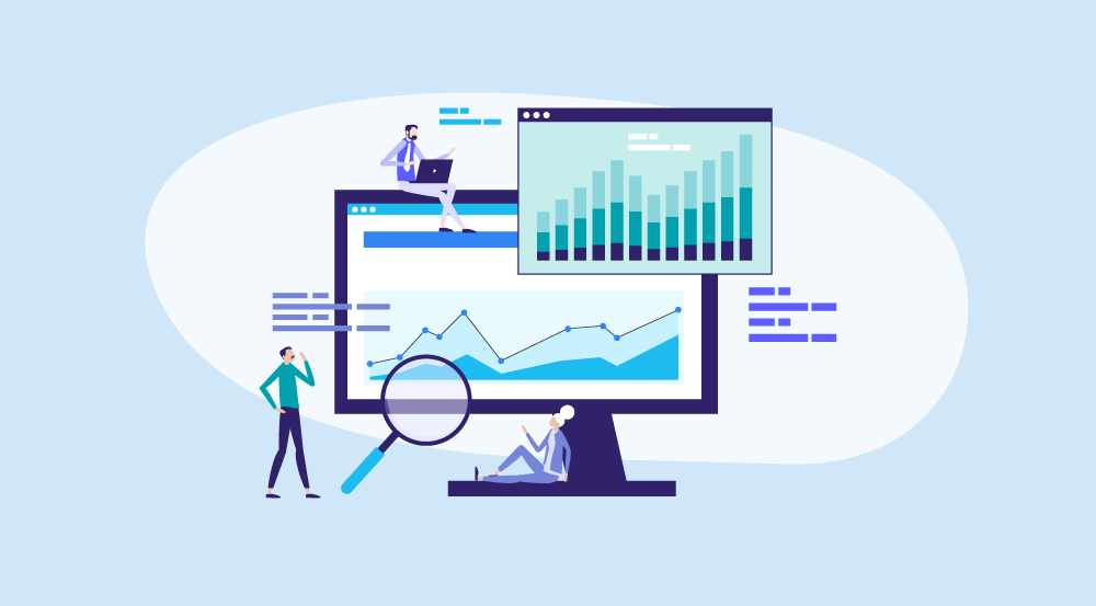
People analytics involves collecting data and using the findings to make strategic, data-driven decisions on human capital. This also demonstrates HR’s strategic value to the business. A people analytics dashboard is a digital interface that enables HR teams to view and analyze real-time workforce data from various sources.
It visually displays common data points like headcount, turnover rates, and employee engagement (e.g., in charts and graphics). This makes it easier to understand and identify trends, issues, and opportunities early on. As part of a broader trend toward data-driven HR, people analytics dashboards will also be essential in the future of HR analytics.
How is a people analytics dashboard useful to HR?
Using an HR analytics dashboard offers several benefits to HR teams, including:
- Better decision-making: Real-time data offers HR leaders data-backed insights, which they can use to make more well-informed, evidence-based decisions.
- Improved workforce planning: A workforce analytics dashboard can help HR conduct a skills gap analysis, optimize headcount, and forecast future workforce needs.
- Higher retention rates: People analytics data can determine turnover risk, allowing you to implement prompt employee retention strategies. It also helps in identifying high-potential employees.
- More effective DEIB strategies: You can use people analytics to monitor DEIB strategy progress with real-time diversity metrics and make improvements accordingly.
- Increased HR efficiency: Automated reports and centralized data free up time for you to focus on more strategic tasks, and increase cost savings and operational efficiency.
- Stronger business alignment: Collecting and analyzing people data to help you make informed decisions also enables you to align HR goals with broader business objectives.
- Clearer communication with stakeholders: A people analytics dashboard helps leadership better understand data by simplifying key information and driving more transparent communication.
Learn to create and use an effective people analytics dashboard
Build your skills in creating and using an effective people analytics dashboard to give your HR team detailed workforce data and improve the employee experience.
AIHR’s People Analytics Certificate Program teaches you to analyze people data in Excel, build interactive HR dashboards and reports in Microsoft PowerBI, and use people analytics to identify workplace trends and measure policy effectiveness.
9 people analytics dashboard examples
Let’s explore some examples of popular people analytics dashboards, how they work, and what problems they can help your HR team solve.
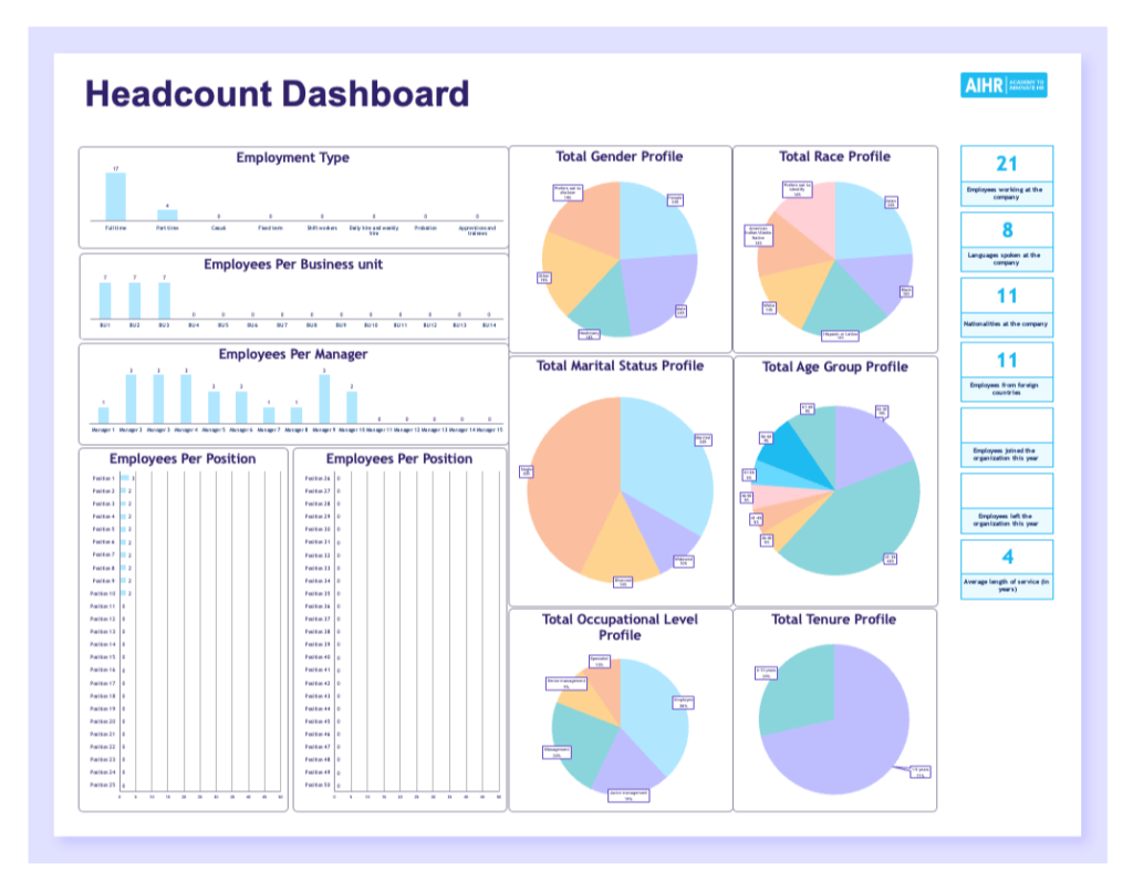
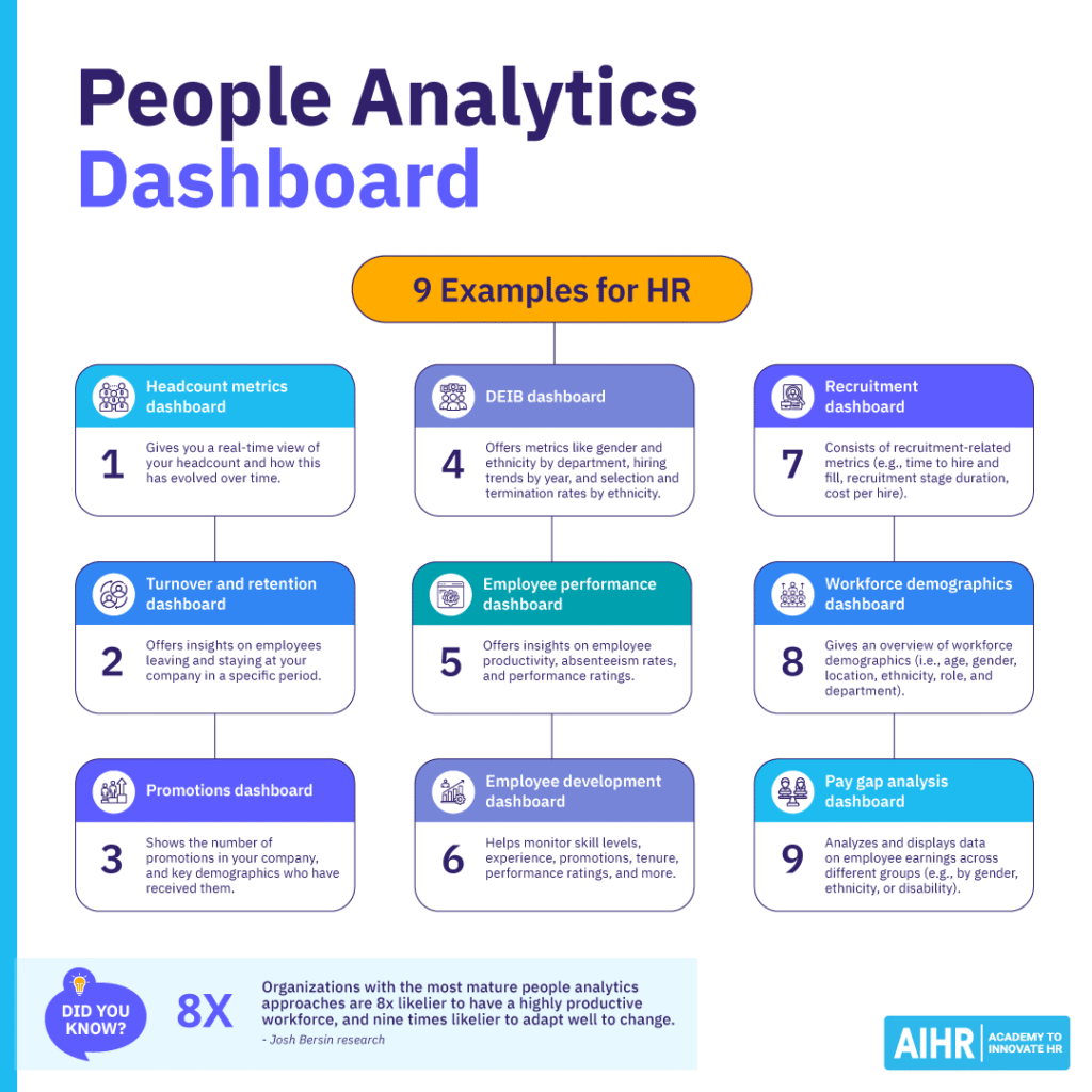
Example 1: Headcount metrics dashboard
This dashboard provides a real-time view of your workforce size and structure. You can track headcount changes month-to-month or year-on-year, and see the mix of full-time, part-time, and contract staff. It also shows performance and time since last promotion for each employee, helping you spot top performers and identify who’s ready to move up. You can download our free template in Excel.
Example 2: Turnover and retention dashboard
This dashboard helps you track who’s leaving, who’s staying, and why. You can use it to see monthly turnover trends, compare them to the previous year, and view data by department or position. It also enables you to spot high-turnover areas and reasons for exits (e.g., long hours, poor performance, or better offers elsewhere) so you can take appropriate action.
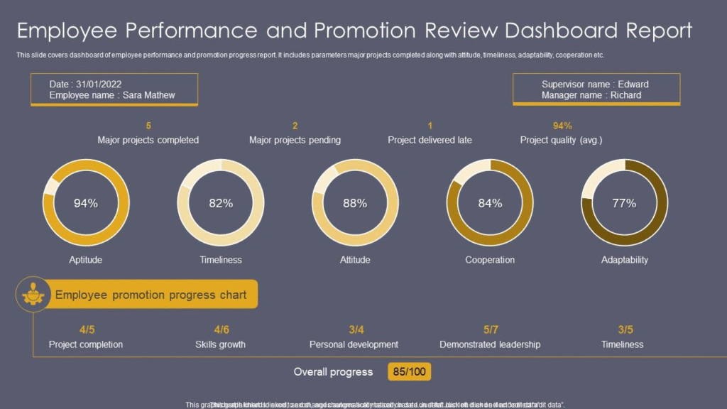
Example 3: Promotions dashboard
A promotions dashboard shows who’s getting promoted, broken down by gender, age, education, and department, helping you spot potential bias or imbalances. Managers can use this dashboard to track employee growth and skills over time, while employees can use it to understand their career paths and what it takes to get promoted.
Example 4: DEIB dashboard
A Diversity, Equity, Inclusion, and Belonging (DEIB) dashboard tracks metrics like gender and ethnicity by department and job level, along with hiring, promotion, and termination trends. It shows how inclusive your practices really are. For example, if most promotions go to one group and others face high exit rates, this highlights deeper issues you must address urgently.
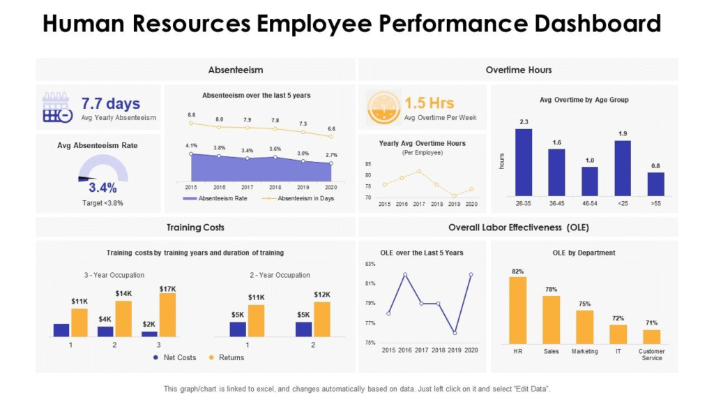
Example 5: Employee performance dashboard
An employee performance dashboard allows you to track important metrics like productivity, absenteeism, overtime, and performance scores. This helps you identify top performers, trends over time, and differences across teams. It also helps your HR team set benchmarks, boost performance, and catch and address problems early.
Example 6: Employee development dashboard
An employee development dashboard helps you monitor skills, training completion, promotions, satisfaction, and performance. You can see how training links to performance and identify which programs are working or not. Use this dashboard to make learning and development efforts more effective and help employees grow while supporting business goals.
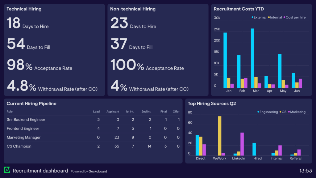
Example 7: Recruitment dashboard
A recruitment dashboard covers time-to-hire, stage durations, cost per hire, and monthly offers. It helps you see where strong candidates come from, streamline hiring, and keep costs under control. It also highlights weak spots in the process, so you know what you must do to improve your organization’s candidate experience and employer branding strategy.
Example 8: Workforce demographics dashboard
A workforce demographics dashboard offers an overview of the demographics of your entire workforce, including age, gender, location, ethnicity, role, and department. You can use this data to look for trends and changes over time, as well as any imbalances or disparities. This can help your organization build and retain a diverse workforce.
Example 9: Pay gap analysis dashboard
This dashboard displays employee earnings data across different groups, such as by gender, ethnicity, or disability. It provides a good indication of how fair your company’s pay structure and policies are across roles and departments. You can identify any disparities between different groups, highlight the reasons behind them, and address them promptly.
How to build and use a people analytics dashboard
Here are some useful tips to help build and use an HR analytics dashboard in your organization.
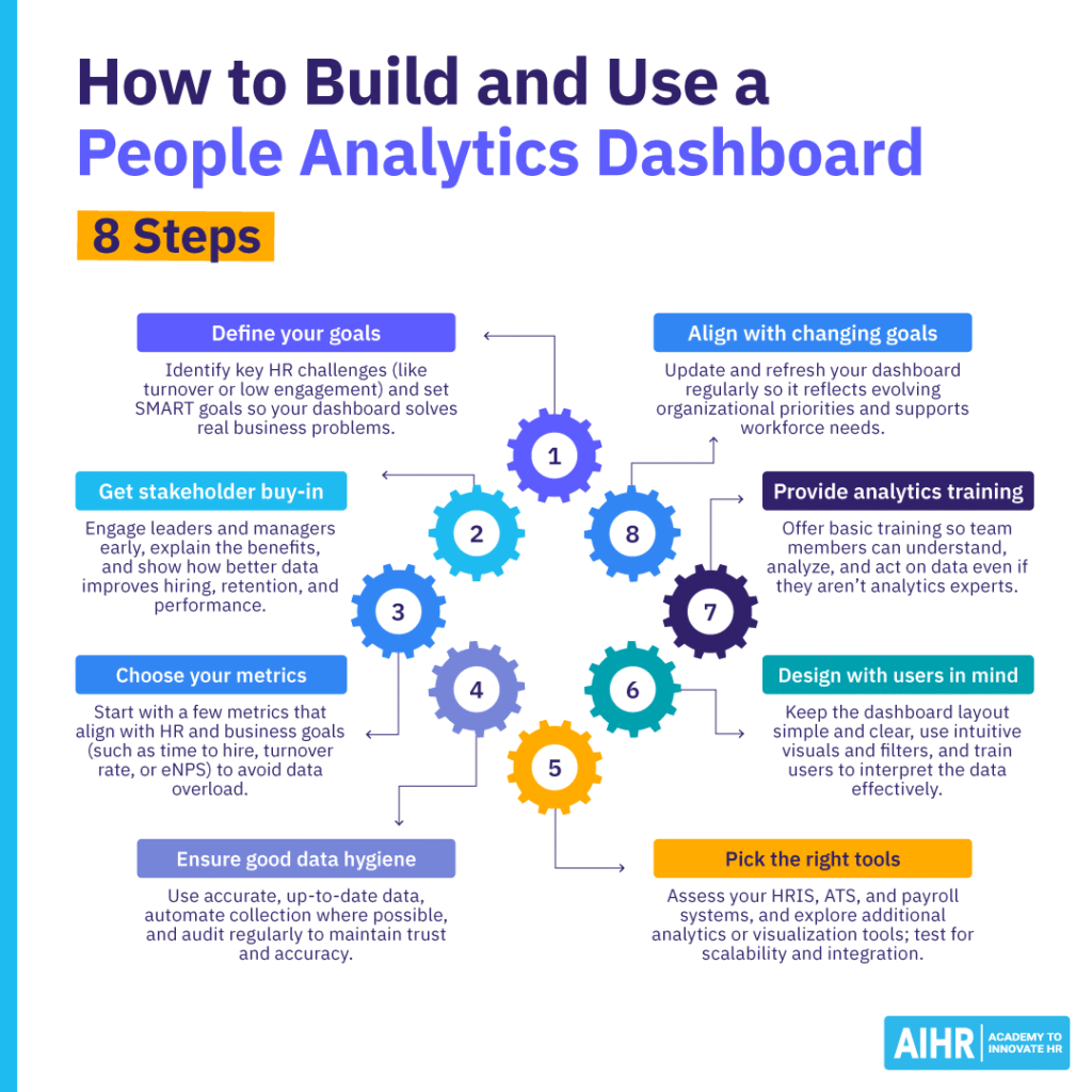
Define your goals and the reasons behind them
Start by identifying the specific challenges your organization is facing. Is it high turnover, low engagement, or poor internal mobility? Once you’ve identified the key issues, set HR SMART goals for your HR team to ensure your dashboard is focused on solving real problems and not just tracking data for the sake of it.
Get stakeholder buy-in early
Before building your dashboard, talk to leaders, department heads, and managers. Explain how people analytics support business decisions and what insights they can expect. Show them how better data can lead to better hiring, retention, and performance. The earlier you bring stakeholders in, the more likely they are to support and use the dashboard once it’s live.
Choose your metrics carefully
More data isn’t always better — in fact, it can be overwhelming and affect engagement. Focus on key metrics aligned with business and HR goals (e.g., time to hire, turnover rate, or eNPS). Starting small makes data easier to manage and understand. You can always include more metrics later, once the dashboard is established and your team is used to it.
Invest in good data hygiene
To make your dashboard useful, ensure the data you feed into it is clean, accurate, and up to date. Automate data collection and updates where possible, and pull from reliable sources. Regularly audit your data for duplicates, outdated entries, and inconsistencies to prevent errors, build trust in the dashboard, and help you make fact-based decisions.
Pick the right tools
Assess existing tools — e.g., your HR Information System (HRIS), Applicant Tracking System (ATS), or payroll software — and see what data they can provide. Then, explore additional tools to fill the gaps, like data visualization platforms or full-service people analytics solutions. Use free trials to test functionality, scalability, integration, and ease of use before making a decision.
Design with users in mind
Keep your dashboard’s layout simple and focus on what its users need to see most. Use clear labels, easy-to-read graphs, and filters that help users focus on specific areas. Train your team on how to use it and explain what the data means. The easier the dashboard is to understand, the more people will rely on it and the more value it will deliver.
Offer your team basic analytics training
Only 6% of people managers can analyze and explain data, yet only 12% of companies offer data interpretation training. A data-driven mindset enables your team to make data-driven decisions. Not everyone needs the data skills of a people analyst, but everyone should get basic training on how to use the software, aggregate and analyze data, and update systems.
Align your dashboard with changing business goals
The right data in your dashboard helps you develop processes and policies aligned with short- and long-term business goals, improve the employee experience, and boost profitability. As the organizational goals change, your people analytics strategy should keep up with and reflect these changes. Refresh your data so it always works for the HR team and the broader workforce.
HR dashboard software to support people analytics
Let’s explore some types of HR dashboard software your HR team can use to support their people analytics strategy:
- Crunchr: Crunchr pulls, cleans, and consolidates all your data into a single source of truth and helps you unlock AI-driven insights. It comes with hundreds of pre-built, custom dashboards and an AI assistant to answer questions on hiring, retention, and more.
- Lattice: Lattice centralizes your employee demographics, performance, engagement, and career growth into HR dashboards that give you a holistic view of your workforce with real-time data. The adoption dashboard feature shows you how to improve participation across your people programs and maximize impact.
- Power BI: With advanced data analysis tools, AI capabilities, and a user-friendly report creation tool, Power BI can help you create a data-driven culture. BI can scale as needed, allows you to embed and share reports in other Microsoft services, and helps you govern and protect your data.
- Tableau: The world’s first agentic analytics platform, Tableau features built-in visual best practices, fully integrated AI/ML capabilities, governance and data management, and visual storytelling. It also gives users access to the Tableau Community, where they can connect with like-minded people.
- Visier: Visier can help you build, scale, or extend your people analytics strategy. It helps you deliver insights and impact at speed, and automate and scale analytics, allowing your organization to retain the right people, build internal mobility, and optimize talent acquisition.
To sum up
A people analytics dashboard can help HR teams operate more efficiently, make better decisions, improve retention, and achieve stronger alignment with business objectives. To get the most out of your dashboard, treat it as a living tool instead of a one-off project.
Keep refining your metrics, updating your data sources, and adjusting your dashboard as your organization evolves. Involve your team regularly, review what’s working and what’s not, and make changes that reflect the real needs of the business. The more you iterate, the more valuable your people analytics dashboard will become.